Hello 👋 .
I posted this review on my (internal) work blog, with the intention of putting it here too. So here it is, too, modified a bit for a wider audience.
I’ve read a couple of books lately that I’ve really wanted to share with people so I thought I’d chat about them here.

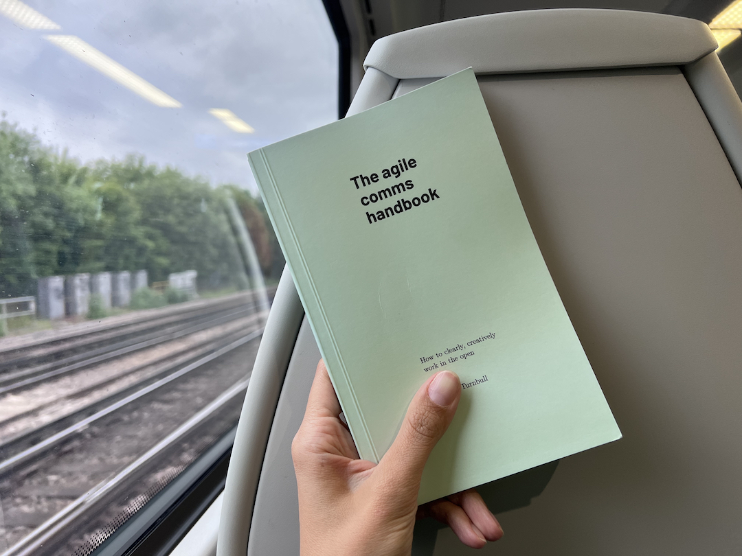
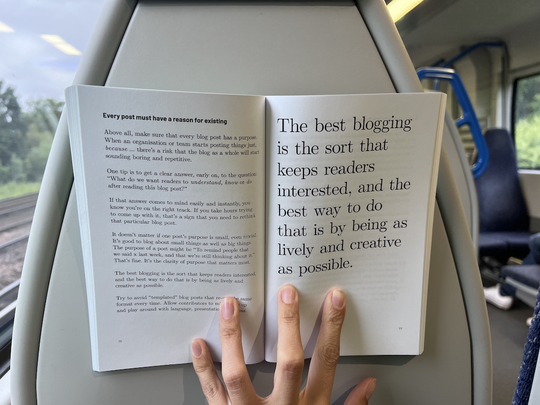
Anyway, onto The Agile Comms Handbook. This book is great, really. Very easy to read, no bits where I was like “OK pal, we get it” which is because I think Giles, the author, has focussed on editing down his words the the minimum he needs to communicate the thing.
It has some powerful ideas I think we (at the FT) should really seriously listen to:
Three layers of comms
An early idea that Giles introduces is the three layer cake of comms.
On the top is the “lure” - this is a tweet length summation of what’s going on. It invites people to read more, but allows them to determine if they’re actually going to find the “reading more bit” interesting or useful. It should grab people’s attention because people are busy!
Next on the cake is the “context” layer. This might be a blog post, or the body of an email. It tells people enough, but not so much that they don’t have time to read it all.
The final layer is the “detail”. This is the work we’re already doing. It’s tables, architecture diagrams, decision docs. This is what many of us think of as the actual work but we can’t expect stakeholders to dive into all that work, because it’s too detailed and they don’t have the time.
Any time you want to “do a comms” it can follow this format. eg - there is a technical incident that we need to email senior stakeholders about. The lure is the email subject. The context is the body of the email. It includes some digestible info about the incident and most importantly any actions the recipients need to take. The detail is linked to from the email or in an attachment.
In places we already work like this but I found the way Giles laid this all out very helpful.
Organisational presentation decks fall into two categories. The kind for presenting in front of and the kind for sharing
We (in product and tech at the FT) are so bad at confusing these. The presenting kind of deck is for standing in front of (or presenting over video). These should be low on deep detail, and act as a support for the words you’re saying. Our monthly all team update should be like this!
The other kind is also a valid form of deck, but it’s the one people read in their own time, it should stand alone as a document or record of a thing. It doesn’t work as a presentation because there’s too much detail, too many bullet points, tables of data. If you tried to present this deck you would lose the audience from what you’re saying in the details.
Giles reckons you if your slides of type 1 are going to be shared after the fact then they should be either rewritten to include all the nuanced things you’ve said alongside them, or should actually just be a blog post.
Blogging is good and easy
This is an idea I’m going to take directly to the current projects I’m overseeing at the FT. Listen folks, blogging isn’t a big deal. Be cool. Confluence has a nice workspace thing, which makes it really easy, and I want the team to share ideas early and often, adhering to the previously explained “lure”, “context”, “detail” cake of comms.
I really hope this way of working will save us the pain of that thing where detail and context is spread across a plethora of google docs that nobody can find.
I also hope this way of working will allow us to share pictures of Kevin Mcloud. This has already happened.

OK, thatssit. This book is good, and short! Really! Who wants to borrow?